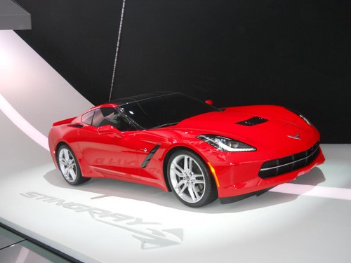
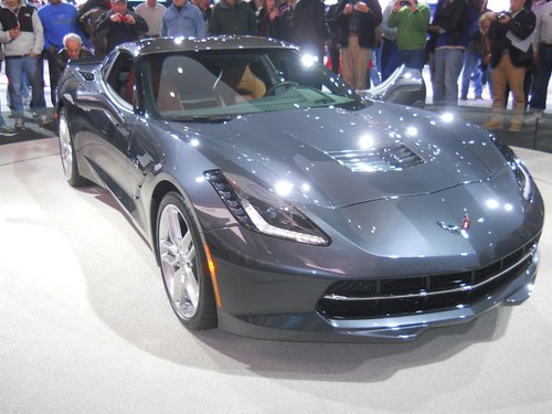
This red beauty was bolted up on the wall, while a drab gun metal gray Vette was on display on the floor. For the life of me, I can't figure out GM's obsession with such plain colors. They did the same thing unveiling the Camaro ZL1 a few years ago, with the same ugly ass gray. I like the red. I like the black side vents and ducts atop the 1/4's. The hood vent though, I think would look better in the body color, same for the roof. I don't like the way the black breaks up the body color. Paint those a-pillars red too.
They absolutely nailed the styling on the new Vette. The body lines are sharp, and plentiful. It is apparent that it's a Corvette, and yet you would be hard pressed to find similarities with former models. It has been very tastefully evolved into more of a worldwide contender amongst the European counterparts.
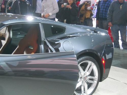
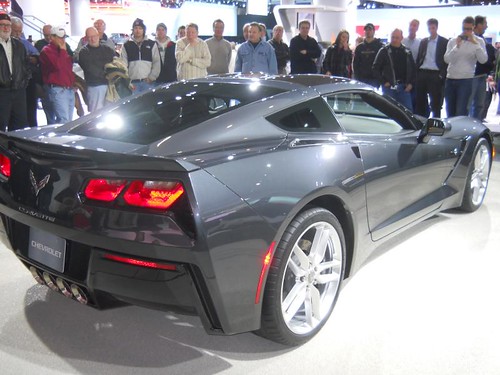
The flat shoulders on the 1/4 panels look tough. Maybe it's just an illusion, the but 1/4 panels don't look so big and flat with the C7. Quite possibly, thanks to the sharper lines and flat shoulders, which create an obvious break in the body lines.
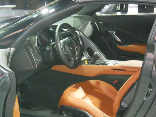
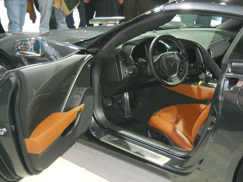
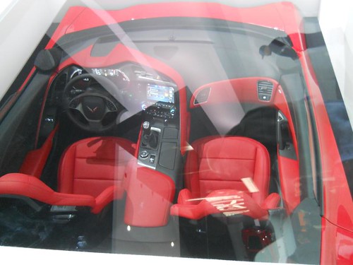
The interior appears to have been upgraded, and hopefully the seating complaints past Vette owners have had has been addressed.
Interior shot with the door panels.
Here was a display on the wall of the interior. Sadly, the plexiglass cover didn't allow for a shot without a glare. Still, it gives a much better overall view of the revised interior.
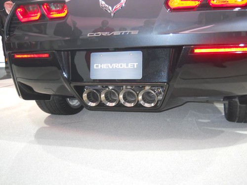
Some have complained about the rear of the car, and how it looks too Camaro-ish. There is not doubt that you can see a slight amount of Camaro styling, but there is no confusing this for a Camaro. While probably my least favorite part of the car, I don't find it as bad as many other have. It still looks a bit fat to me, and very similar in design to many other sports cars, which leads me to believe that a lot of it is for functional reasons to diffuse the under car air.
I actually kinda like the quad tips.
I like the stance of the car, or maybe I should say the side design. It almost has a crouching look to it.
I still don't understand the Stingray. There is a time and a place for nostalgia, and the Corvette isn't it. Why bring back a nameplate from decades ago, and place it upon your halo car, a car featuring the best of the best technology and performance? The same is true for the LT1 engine. The name has been recycled 3 times now, though inititially the LT-1, the names the same. While the little stingray emblem is cool, it looks out of place in my opinion.
This is the best of the best, and will surely take the Corvette to another level. I will say this, with each generation, they are running out of rungs to climb. Could the ZR1 be the undisputed champ, alone at the top? I'm sure we will have to wait another year or two to know the answer to that.




No comments:
Post a Comment